|
|
2010-08-24 22:00:43 ET
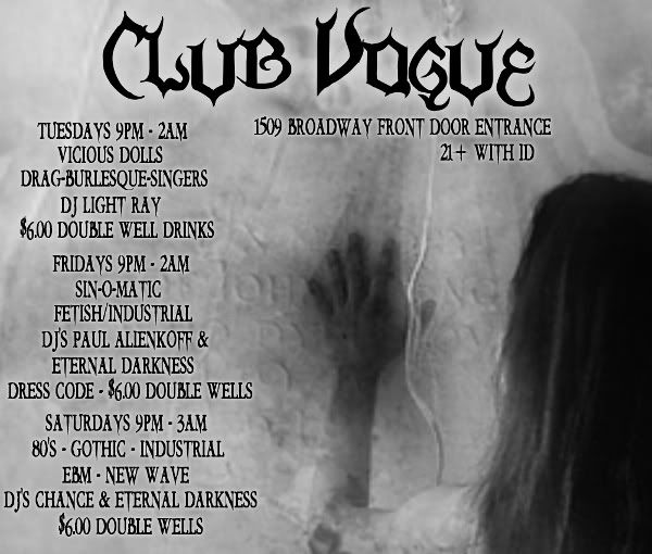
goin offa what turbo said, you got a lot of text information there and it could probably be arranged with more grace to make it much easier to be consumed by the magazine reader.
As a reader, i have no idea what to look at first. You have 3 key pieces of information: the date and time, the performers, and the drink specials, and since it all looks the same (gothic font, black, size 18?, centered), you've essentially placed them all in the same hierarchy of importance. Whats the most vital piece of info, the time frame for an event, or the drink special for that event?
I would play around with font sizing and orientation. Centered text is safe and conventional, but with that much text, it makes it harder on the reader. |
|