2025-06-16 20:54:58 ET

decided to stick the dev / public / whatever-apple-is-calling-it-these-days beta version of LiQuId gLaSs mac OS 26™ on my aging intel (👎) macbook pro.

• on first installing, the fan just blasted at full speed for like a good 20 minutes straight before finally settling down and now only having periodic and seemingly random outbursts.

• everything (including typing this entry) is laggy as all literal actual heavenly fuck. given the UI is functionally little more than a modern sequel to the old aqua interface, i would say the amount of lagginess is surprising. i would say that, but in the post-steve-jobs era apple's increasing de-prioritization of optimization (which, frankly, sucks) makes this actually not particularly surprising. since it's the first fuckin publicly available beta, we'll see how long it takes whatever Good Apple Devs they still have left over there plus all the Google And Microsoft Literal Actual Total Retards they've inexplicably poached from those companies under cook's leadership to fix it so it's no longer this way. i'll certainly be sending them all the feedback. maybe they'll finally just hire me instead.

• even the in-browser Subkultures® Old-Ass-Code™ UI of the text box i am typing this entry into, as well as the buttons and checky boxes, are now all showing up noticeably more rounded off at the corners than before. i'm actually pretty ok with this. it does feel more distinctly apple than anything apple has put out there since the aqua era.

• the dock, while having a nice background effect in theory - most noticeable when moving windows around or behind it - actually looks quite fugly when it's just sitting there the 99% of the time one is using the OS otherwise. oh well, i'm sure they'll do something with it as this goes along.

• the mouse cursor keeps randomly becoming huge for occasional moments under normal use - normally this is only triggered by rapidly wiggling the mouse cursor around, which i am absolutely not doing, so i am presuming it's down to the aforementioned perpetual massive lag.

• the trash bin icon is....... actually WTAF is this?


...


all that aside i do like the "new"* UI direction overall even if it feels like the team apple has pushing this stuff out these days is a shadow of what they had under steve. oh well.

*"new" is in quotes because seriously it just feels / looks like aqua v2.0, not that that's a bad thing.

also in response to every internet-tard currently riding the almighty engagement algorithm posting OmG iT'S jUsT rIpPiNg oFf WiNdOwS vIsTa all over youtube / twitter / whatever - you absolute geniuses do realize literally everything that windows vista was attempting to do visually was LITERALLY a half-assed (well more like 1/4-assed and even that's being generous) ripoff of various things mac OS X had already been doing visually for, like, a decade prior to vista ever showing up right? no, because you just started using a mac last tuesday and you're absolutely clueless? oh, ok.

...though i will say the lag on this beta version certainly is one thing that feels rather vista-like. LOL SICK BURN WINDOWS GOTCHU.

time to go have a massive poop now.


[important poop update]

the poop i’m having is, in fact, massive.


2025-06-17 09:59:13 ET

The trash can icon is literally trash. lolz.

I think both things can be true at once - to me it's kind of Aqua 2.0 by way of Windows Vista, a weird incestuous mutant baby of a UI that seems more like the product of some suit telling the design team "HEY WE NEED A NEW DESIGN SYSTEM" instead of it actually being the product of any usability studies or well-directed creativity.

With that said, have you noticed any practical changes? I've found that as they attempt to make it more consistent and iPhone-like (It Just Works!™), it has incrementally become increasingly developer hostile (despite still being easier to deal with than Windows, for my purposes).

+10 points for Mr. Horse btw

2025-06-17 17:04:15 ET

i mean, i like that apple is trying to build a more distinct design scheme and bring back some long-missed skeuomorphism that used to be one of their defining characteristics, so i'll give it time to keep baking. but yeah the trash icon is horrible. most of the other iconography i'm fine with though.

i see a lot of potential for positive practical change but at this point, particularly on my unfortunate intel machine, it's so damn laggy it's tough to give an objective opinion on that.

unfortunately it would appear they still haven't fixed SpotlightKnowledeEvents rapidly eating up a ton of pointless storage space even though they've allegedly fixed spotlight otherwise.

right now i'm just trying to decide if i want to put up with the lag and still use it for work regardless or if it's enough of a hindrance that i'll temporarily put sequoia back on it and try again when the next beta update drops. will decide that by tomorrow.

i do like what they're going for and that at least they're trying to do something that feels like an honest attempt at both being unique and also properly iterating and paying homage to apple's design history more broadly so i don't think it's just change for change's sake this time around - but we'll see how it actually develops. i kind of give apple the side-eye with everything they do these days, even things i'm otherwise cautiously optimistic about, since they seem to have developed an impressively solid track record of "mostly-better-than-the-competition-still-but-at-the-same-time-nowhere-near-what-it-should-be" with the latter half of that statement being the increasing factor for years now since steve died.

one thing that is just awful is how horrendously unoptimized things are in terms of size, which has been another ongoing and increasing problem they've had (still nowhere near as bad as microsoft but that's an abysmally low bar) for years now. FFS if i want to test drive this thing on my iphone it requires 20 goddamn gigs of free space just for the iOS beta update if i don't wanna workaround and just download it from my mac (which is something i've already been doing with regular iOS updates lately cause they're also all way too damn big). one of apple's primary sources of pride and even selling-points under steve (and also one thing that made vista so laughable in comparison) was that virtually every update apple came out with to everythig ever, whether OS X or iOS, took up the same amount of space or less than the previous OS while simultaneously adding a ton of useful features and visual elements. now it feels like they've just stolen so many idiots from google and microsoft that those two companies' same lazy-ass "optimization? lol no." mindset has started to become an absolute virus at apple as well.

...i guess we'll see how things keep developing. i like the direction this could go. we'll see how long it takes it to feel as good as it's attempting to look.

2025-06-17 17:05:09 ET

also mr. horse was the first thing that popped into my mind when i saw the new trash bin icon. lol. FFS it looks like mr. horse fuckin sat on it.

2025-06-17 17:49:40 ET

> "mostly-better-than-the-competition-still-but-at-the-same-time-nowhere-near-what-it-should-be"

I think that's a really good way to sum it up.

Also, this is fucking hilarious:

2025-06-17 18:06:05 ET

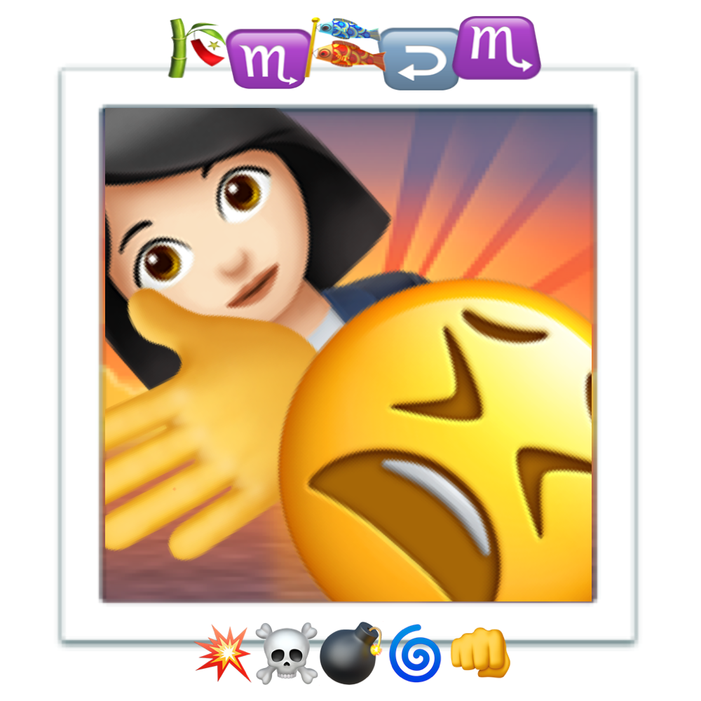
oh yeah back when i was way more active on reddit i remade the KMFDM symbols album cover entirely out of emoji. i guess it shows up first in my documents folder (and thus is on the top there) cause it's file name is literally 💥☠️💣🌀👊.png - here, lemme upload the full size version again since i have no idea where that reddit post is now. somewhere in the deep annals of r/KMFDM if it still exists since i no longer have that account. lol.

2025-06-17 19:06:15 ET

lol thanks that's fucking awesome

2025-06-17 20:59:52 ET

i definitely consider it one of my finest achievements. IIRC it spawned from a conversation on reddit about how now that we have emoji we no longer need to call the album “symbols” and can literally just type out the title instead. and then that led to “hey but can the entire album cover also be recreated entirely with emoji????”

turns out yes. absolutely yes.

  Return to turboskanker's page